Overview: Responsive Design vs. Mobile-First Design — this is the question every WordPress developer faces. The answer isn’t very difficult; all we need to do is evaluate a few things. Read on more!
In the ever-evolving world of web development, ensuring your WordPress site provides a seamless experience across all devices is more important than ever. With mobile internet usage continuing to rise, the debate between responsive design and mobile-first design has become a central topic for developers.
Each approach offers unique benefits and challenges, making the decision crucial for the success of your website. In this reading, we will explore the differences between responsive and mobile-first design, helping you determine which strategy is best suited for your WordPress site.
So whether you’re aiming to improve user experience, boost performance, or future-proof your online presence, understanding these design philosophies will guide you toward making an informed choice.
Are you ready for the scoop of knowledge?
Understanding Responsive Design
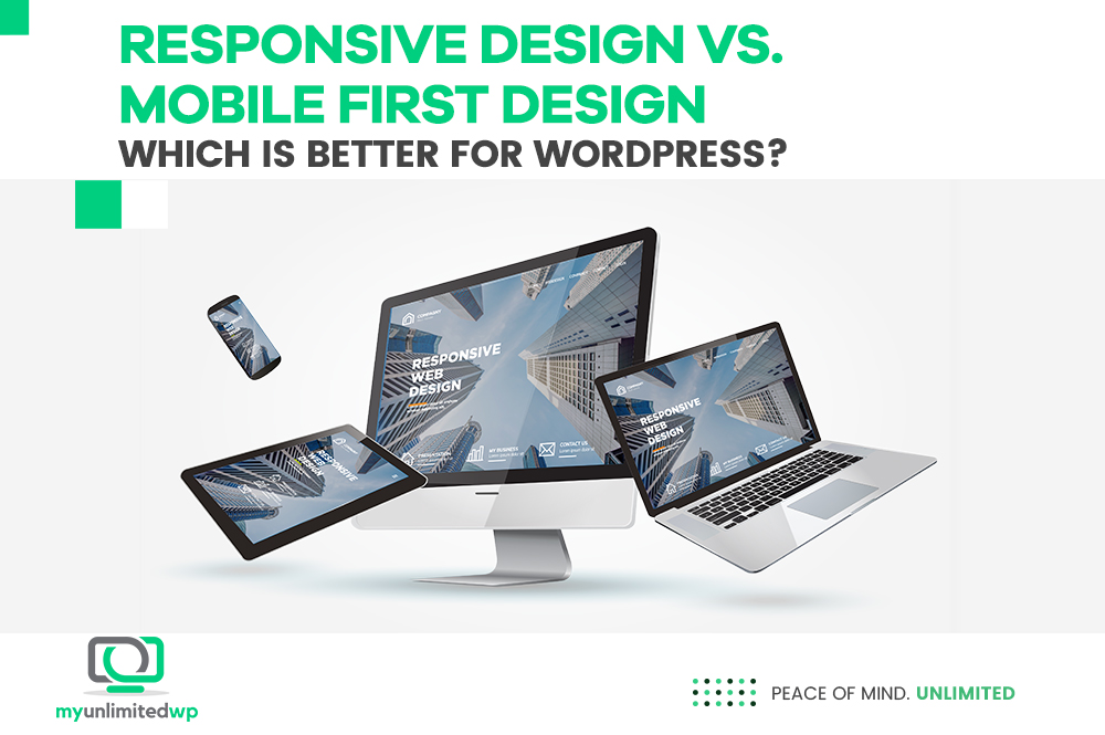
Responsive design is a web development approach where a website is designed to adapt to different screen sizes and orientations automatically. This is achieved through fluid grids, flexible images, and CSS media queries.
Key Features of Responsive Design:
Fluid Grids: Layouts are designed in terms of proportions rather than fixed pixels. This ensures elements resize smoothly across different devices. For example, instead of defining a column width as 300 pixels, it would be set as 30% of the container’s width. This proportional approach ensures a harmonious and adaptable layout that adjusts naturally to various screen sizes.
Learn more about Fluid Grids here.
Flexible Images: Images scale according to their containing elements, preventing overflow and maintaining visual integrity. By using relative units like percentages instead of absolute units like pixels, images remain visually consistent without causing layout issues or requiring separate image sets for different devices.
Media Queries: CSS media queries apply specific styles based on device characteristics like screen width, height, and resolution. This allows developers to create breakpoints where the design adjusts its layout and features to provide the best possible user experience across different devices.
Advantages of Responsive Design
Versatility: A single design works across all devices, from desktops to smartphones. This means you can create a cohesive experience without developing separate versions of your site.
SEO-Friendly: Google recommends responsive design, enhancing your site’s search engine ranking. A unified URL structure and consistent HTML across all devices improve SEO by avoiding content duplication.
Maintenance: Managing one codebase is easier than handling multiple site versions. This simplifies updates and ensures consistency, reducing the time and resources needed for site maintenance.
Understanding Mobile-First Design
Mobile-first design is an approach where the design process starts with the smallest screen size and gradually scales up to larger screens. This methodology ensures that the primary focus is on mobile users.
Key Aspects of Mobile-First Design:
Minimalism: Prioritizing essential features and content for mobile users. By focusing on the core functionality and removing unnecessary elements, mobile-first design emphasizes simplicity and usability.
Performance Optimization: This ensures fast load times and smooth performance on mobile devices. Mobile-first design inherently prioritizes performance, leading to lighter, faster-loading pages that enhance the user experience.
Progressive Enhancement: Adding features and content as the screen size increases, ensuring the best possible user experience across all devices. This strategy builds upon a solid mobile foundation, incorporating more complex elements for larger screens without compromising the mobile experience.
Advantages of Mobile-First Design:
Focused User Experience: Prioritizing mobile users can lead to a more streamlined and efficient design. By addressing the needs of the most constrained devices first, you ensure a functional and intuitive experience for all users.
Performance: Optimizing for mobile ensures faster load times and better performance on smaller devices. This can lead to higher engagement and lower bounce rates, as users are less likely to abandon slow-loading sites.
Future-Proofing: With the increasing use of mobile devices, a mobile-first approach keeps your site ahead of the curve. As mobile traffic continues to grow, starting with a mobile-first mindset ensures your site remains relevant and effective.
Which Is Better for WordPress?
Deciding between responsive and mobile-first design for your WordPress site depends on your specific needs and goals. Here’s what we as website developments experts at MyUnlimitedWP analyze:
Responsive Design is versatile and provides a consistent experience across all devices, making it a solid choice for sites with a diverse audience and existing content. It aligns well with SEO best practices and simplifies maintenance with a single codebase.
Mobile-First Design prioritizes mobile users, offering a streamlined and efficient experience that is optimized for performance on smaller devices. This approach is ideal for sites with a predominantly mobile audience and those looking to future-proof their online presence.
In Summary
Both responsive design and mobile-first design have their advantages and challenges. The best approach for your WordPress site depends on your audience, goals, and specific requirements. Once you understand the strengths of each method, and WordPress’s flexible ecosystem, you can create a site that offers a seamless and engaging user experience, regardless of the device.
So whether you choose responsive design or mobile-first design, the key is to prioritize your users and ensure your site is accessible, functional, and visually appealing across all screens.
Do you agree?